Welcome to the
Purpose Disruptors brand guide.
Our new brand toolkit represents a new phase of the Purpose Disruptors story. We are approaching our work with a redoubled confidence and clarity in our mission: to change advertising for good.
Below you’ll find tools and advice to how to use our new brand, from logos and graphic assets to tone-of-voice and templates. Please stick as closely as possible to the sentiments and specifics of these guidelines, to ensure consistency across our communications and maintain our distinct look and feel in the landscape of climate action and the creative world.
Logo
Our logo comprises the letters ‘P’ and ‘D’ combined within one symbol, formed of two shafts of light. The symbol is bold and straightforward while the split between the two geometric shapes communicates dissonance and disruption, and its angles cast up and to the right, projecting a way forward.
The logotype, set in our brand font, is confident and professional while maintaining its own personality and approachability in the tall, almost anthropomorphic shapes of the characters.
There are three different lockups of the logo that can be used for different applications. The horizontal layout is the primary logo, as it will work easily in most situations.
Please only use the lockups provided, without changing any of the proportions, stretching or otherwise altering.
Shapes
The shapes used in our logo form the basis of our extended visual language. Within the metaphoer of shining a light on the future, these shapes are used to create dynamic negative space in layouts, using different crops depending on the nature of the content.
Please only use the shapes provided.
When creating new shape layouts, use the guides shown here as a reference.
Keep a roughly equal number of rectangle and semicircle shapes in the same layout
Shapes should never overlap or come into contact with each other
Each shape should have its own column
Colour
Our colour palette consists of just two colours: Black and Ice White
This strict minimalism helps us stand out in our field, and allows our work to shine through. This approach also helps us convey the urgency of our mission and puts the issue into stark relief, while we remain playful with other assets of the brand.
Typography
Our brand font family is ‘Adapt,’ a slightly condensed sans-serif that has its own distinct personality while maintaining a level of professionalism and legibility.
We specifically use the ‘Compact Medium’ weight of Adapt for headlines and pullquotes. This style allows us to be bold and expressive and works great at larger sizes, however lacks the necessary legibility at smaller sizes.
So for body copy and smaller headings we use ‘Narrow Semilight’ and ‘Narrow Medium’.
Typography is usually left-aligned, and we avoid using centred text in most cases where possible.
Please only use the fonts provided where possible
NB:
Where Adapt is not available (eg: Google Slides) we use ‘Barlow Semi-Condensed’. In such cases please ensure you are using the Semi-Condensed version specifically.
Imagery
Based on nature’s vibrant beauty, our library of brand imagery helps us inject vibrance, energy, colour and movement into our layouts.
These can be used as full bleed backgrounds, or contained within our brand shapes.
Our brand images are created bespoke, from images of nature, wildlife and outer-space. Please only use the images provided.
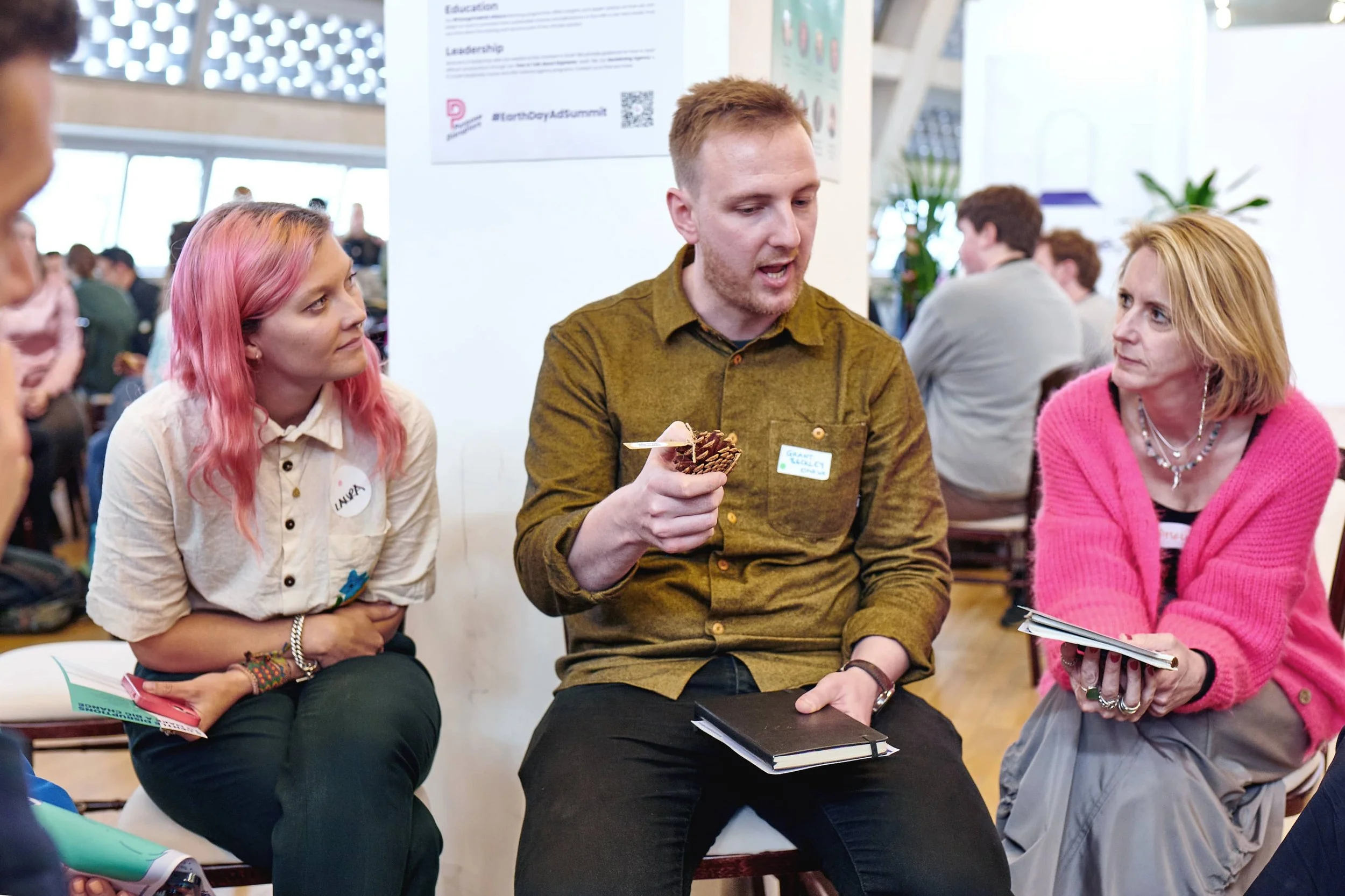
Photography
We use photography of our events and workshops to gorund our brand in the real world work that we do.
When selecting or commissioning photography, the following principles should be at the core of your brief:
Human, Joyful, Inviting, Real
Emphasise moments of focus and contemplation, conversation and reaction, capturing authentic, candid interactions. Use natural light where possible, with a neutral tone and colour balance.
Avoid staging inauthentic poses, forced smiles, people looking directly to camera and washed-out filters.
Tone of Voice
Just as important to the distinctiveness of our brand is how we write.
There is urgency in our mission, but we are proactive in our approach, providing tangle actions and assistance. Coming from the creative industry ourselves, we understand its challenges and we’re creating a supportive network to galvanise our movement.
While there is uncertainty in the way forward, we are assured in our own ability to say what is right, without caveat or judgement, and importantly we aim to inspire our audience with our vision of the future.
Templates & Examples
Use the templates and examples shown here as a reference when creating documents and layouts or commissioning design.
Pay particular attention to how shapes are used both as negative space and to contain imagery, how typographic hierarchy is used to create contrast and draw the eye towards important messages and the interplay between small and large text.
Use column layouts and stick to margins and guides, ensuring typography is lined-up to the edges of the layout, and there is a consistent hanging-line for all main content.


Black
#000000
C90 M80 Y70 K96

Ice White
#EBF0F2
C10 M5 Y6 K0
Adapt Compact Medium is our font for headlines
Adapt Narrow Semilight is our font for body copy, using the Medium weight for emphasis and inline headings


Proactive
Action-oriented, providing solutions
Supportive
Understanding, not calling out


Confident
Self-assured, knowing what’s right
Inspiring
A vision to strive for